In Southern California’s sunlit landscape, color does more than decorate—it defines. It enhances natural light, reflects coastal breezes, and sets the emotional tone for every room.
At Completed Home Improvements, we embrace a color-first approach. Backed by CSLB certification and decades of hands-on experience, our team ensures every project meets the highest standards.
Beyond technical skill, we understand the regional style. This lets us craft color schemes that turn ordinary spaces into personalized sanctuaries.
From concept to final coat, we guide homeowners through every step. The result? A home that strikes the perfect balance between beauty, function, and Southern California flair.
1. Understanding Southern California’s Unique Light & Climate
Expertise:
Southern California’s intense, consistent sunlight—both a blessing and a challenge—affects color perception dramatically. North-facing rooms receive cooler, indirect light, while south-facing spaces are flooded with warm, direct sunlight. West-facing rooms glow in golden afternoon hues, and east-facing areas brighten with crisp morning light.
- Calibration: We perform on-site light studies at different times of day, photographing sample swatches to observe shifts in hue and saturation.
- Climate Considerations: Coastal humidity and interior-exterior transitions influence paint choice—UV-resistant, low-VOC formulations that withstand salt air and minimize off-gassing are essential.
2. Developing a Holistic Color Palette
A. Anchor Neutrals & Accent Hues
- Base Layers: We begin with a neutral foundation—soft whites, warm beiges, or pale grays with subtle undertones (e.g., greige with a whisper of taupe). These anchor rooms and make furniture, art, and textiles stand out.
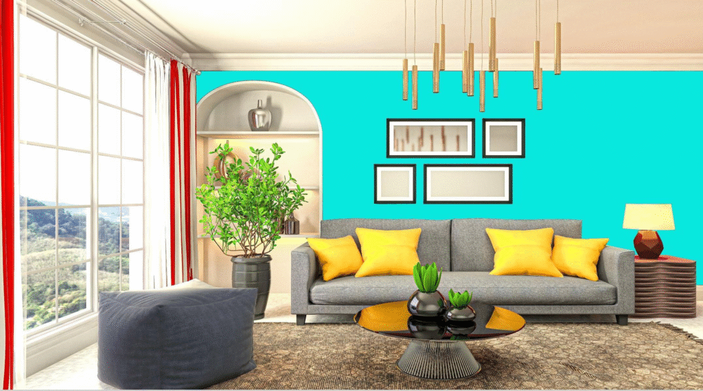
- Accent Colors: Drawing inspiration from Southern California’s coastlines, desert sunsets, and native flora, we select vibrant accents—turquoise reminiscent of Laguna Beach, coral pinks evoking Joshua Tree blooms, or cactus-green tones for natural warmth.
B. Flow & Transition
- Open Floor Plans: In seamless living-dining-kitchen layouts, thoughtful color transitions maintain visual cohesion. We map color “families” on a color wheel—choosing complementary or analogous hues to guide movement from one zone to the next.
- Architectural Features: Built-in shelving, alcoves, and window recesses become focal points when painted in deeper accent shades, creating depth and architectural interest.
C. Material & Finish Coordination
- Textures & Sheens: Flat or matte finishes conceal wall imperfections and absorb glare, ideal for ceilings and feature walls. Eggshell or satin finishes on high-traffic areas provide easy cleaning. Semi-gloss on millwork, doors, and trim accentuates detail and contrasts elegantly with matte walls.
- Complementary Surfaces: Stained wood beams, stone veneers, and tile backsplashes are paired with paint hues that highlight natural undertones—warmer paints under honey-oak beams, cool grays beside slate accents.
3. Color Psychology & Lifestyle Alignment
Authoritativeness:
Decades of design research show that color profoundly influences mood and behavior. We leverage these principles to tailor schemes:
- Calming Bedrooms: Soft blues and muted greens foster relaxation and align with ocean-inspired tranquility. Accents in sandy neutrals or driftwood grays connect to coastal serenity.
- Energizing Kitchens: Warm creams, sunny yellows, or citrus-inspired greens stimulate appetite and conversation—paired with crisp white cabinets and polished chrome to reflect light.
- Focused Home Offices: Subdued neutrals with a pop of teal or deep navy behind the desk create a balanced environment that promotes concentration and reduces eye strain.
4. The Completed Home Improvements Color Process
- Client Consultation & Vision Boarding: We begin with a detailed questionnaire—lifestyle patterns, existing furnishings, regional influences—and create digital mood boards using samples drawn from California’s natural palette.
- On-Site Swatch Application: Our team paints large 18″×24″ swatches on walls in key orientations (north, south, east, west) and photographs them at morning, midday, and evening light.
- Refinement & Approval: Clients review real-time swatch images via our project portal, enabling informed decisions without the guesswork. We adjust undertones or saturation until the palette resonates perfectly.
- Professional Preparation: Surfaces are prepped to CSLB-approved standards—minor wall repairs, priming with stain-blocking primers, and masking surrounding millwork to guarantee crisp lines.
- Expert Application: Using low-VOC, high-coverage paints from premium brands (e.g., Sherwin-Williams Emerald, Benjamin Moore Natura), our technicians apply two finish coats plus touch-ups. Trim and feature elements receive specified sheens for contrast.
- Final Walkthrough & Color Report: We deliver a “Color Report” documenting each color code, finish level, and suggested coordinating fabrics or tile accents—ensuring clients can replicate the palette for future updates.
5. Case Studies: Transformations in Action
A. Coastal Bungalow in La Jolla
- Before: Off-white walls felt bland against rich oak trim and turquoise sea views.
- After: We painted the main living area in a soft sea-foam green (SW 6467 Sea Salt) with crisp white (SW 7006 Extra White) on trim. Accent niches in driftwood gray (SW 7016 Mindful Gray) create a layered, beachy retreat.
B. Mid-Century Modern Ranch in North Park
- Before: Dark wood beams and brick fireplace clashed with beige walls, making the space feel dated.
- After: Charcoal-washed brick and a feature wall in bold mustard yellow (SW 6901 Dijon) play off newly re-stained walnut beams. The remaining walls in pale greige (SW 7036 Accessible Beige) brighten the open layout.
Frequently Asked Questions (FAQs)
Q: How do you prevent paint from fading under intense sunlight?
A: We use UV-resistant acrylic-latex paints with built-in fade inhibitors (e.g., Sherwin-Williams Loxon XP). On southern exposures, we recommend light-reflective finishes and overhangs or UV-coating windows to minimize direct sun impact.
Q: Can I change wall color seasonally?
A: Accent walls, in particular, are ideal for seasonal updates. For instance, you can easily repaint a 6’×8′ section to introduce a fresh, on-trend hue—without the hassle of repainting the entire room. This approach not only saves time and effort but also allows for flexible, stylish transformations throughout the year.
Q: How do you protect my home during painting?
A: Our crews lay protective paper on floors, use dust barriers between areas, and ventilate with HEPA-filtered air scrubbers to minimize dust and fumes.
Q: Do you offer eco-friendly paint options?
A: Absolutely. We stock zero-VOC and low-odor lines (e.g., Benjamin Moore Aura, Sherwin-Williams Harmony) that meet LEED and GreenGuard standards, ensuring safe indoor air quality.
Conclusion
Color is not just an aesthetic choice—it’s a transformative tool that shapes how we feel and interact within our homes. Completed Home Improvements combines regional expertise, precise light studies, and color-psychology insights to deliver living spaces that feel both inviting and uniquely Southern Californian. From concept to completion, our CSLB-certified team ensures every brushstroke aligns with your vision, enhances your lifestyle, and maximizes your home’s value.
Ready to refresh your space with compelling color?
- Call Us: +1 (619) 746-7871
- Email: help@completed-sd.com
- Visit: completed-sd.com to explore our portfolio and schedule a consultation.